
COLOR MANAGEMENT
"Color management" is a process where the color characteristics for every device in the imaging chain is known precisely and utilized in color reproduction.
In digital photography, this imaging chain usually starts with the camera and concludes with the final print, and may include a display device in between:
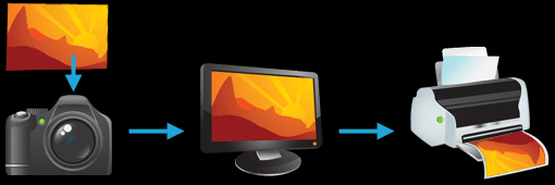
Many other imaging chains exist, but in general, any device which attempts to reproduce color can benefit from color management. For example, with photography it is often critical that your prints or online gallery appear how they were intended. Color management cannot guarantee identical color reproduction, as this is rarely possible, but it can at least give you more control over any changes which may occur.
.
THE NEED FOR PROFILES & REFERENCE COLORS
Color reproduction has a fundamental problem: a given "color number" doesn't necessarily produce the same color in all devices.
Let's say that you're at a restaurant and are about to order a spicy dish. Although you enjoy spiciness, your taste buds are quite sensitive, so you want to be careful that you specify a pleasurable amount. The dilemma is this: simply saying "medium" might convey one level of spice to a cook in Thailand, and a completely different level to someone from England. Restaurants could standardize this based on the number of peppers included in the dish, but this alone wouldn't be sufficient. Spice also depends on how sensitive the taster is to each pepper:
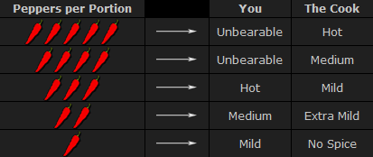
To solve your spiciness dilemma, you could undergo a one-time taste test where you eat a series of dishes, with each containing slightly more peppers (shown above). You could then create a personalized table to carry with you at restaurants which specifies that 3 equals "mild," 5 equals "medium," and so on (assuming that all peppers are the same). Next time, when you visit a restaurant and say "medium," the waiter could look at your personal table and translate this into a standardized concentration of peppers. This waiter could then go to the cook and say to make the dish "extra mild," knowing all too well what this concentration of peppers would actually mean to the cook.
As a whole, this process involved (1) characterizing each person's sensitivity to spice, (2) standardizing this spice based on a concentration of peppers and (3) being able to collectively use this information to translate the "medium" value from one person into an "extra mild" value for another. These same three principles are used to manage color.
COLOR PROFILES
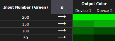
A device's color response is characterized similar to how the personalized spiciness table was created in the above example. Various numbers are sent to this device, and its output is measured in each instance:
Real-world color profiles include all three colors, more values, and are usually more sophisticated than the above table — but the same core principles apply. However, just as with the spiciness example, a profile on its own is insufficient. These profiles have to be recorded in relation to standardized reference colors, and you need color-aware software that can use these profiles to translate color between devices.
COLOR MANAGEMENT OVERVIEW
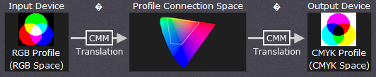
Putting it all together, the following diagram shows how these concepts might apply when converting color between a display device and a printer:
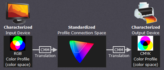
The above color management system was standardized by the International Color Consortium (ICC), and is now used in most computers. It involves several key concepts: color profiles (discussed above), color spaces, and translation between color spaces.
Color Space. This is just a way of referring to the collection of colors/shades that are described by a particular color profile. Put another way, it describes the set of all realizable color combinations. Color spaces are therefore useful tools for understanding the color compatibility between two different devices.
Profile Connection Space (PCS). This is a color space that serves as a standardized reference (a "reference space"), since it is independent of any particular device's characteristics. The PCS is usually the set of all visible colors defined by the Commission International de l' clairage (CIE) and used by the ICC.
Note: The thin trapezoidal region drawn within the PCS is what is called a "working space." The working space is used in image editing programs (such as Adobe Photoshop), and defines the subset of colors available to work with when performing any image editing.
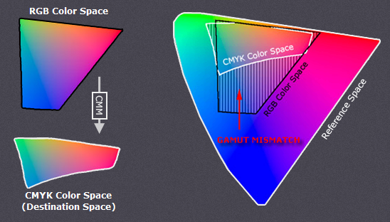
Color Translation. The color management module (CMM) is the workhorse of color management, and is what performs all the calculations needed to translate from one color space into another. Contrary to previous examples, this is rarely a clean and simple process. For example, what if the printer weren't capable of producing as intense a color as the display device? This is called a "gamut mismatch," and would mean that accurate reproduction is impossible. In such cases the CMM therefore just has to aim for the best approximation that it can.
COLOR MANAGEMENT: COLOR SPACES
A "color space" is a useful conceptual tool for understanding the color capabilities of a particular device or digital file. When trying to reproduce color on another device, color spaces can show whether you will be able to retain shadow/highlight detail, color saturation, and by how much either will be compromised.
VISUALIZING COLOR SPACES
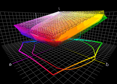
A color space relates numbers to actual colors, and is a three-dimensional object which contains all realizable color combinations. Similar to how one would organize a paint palette, each direction in "color space" often represents some aspect of color, such as lightness, saturation or hue (depending on the type of space).
The two diagrams below show the outer surface of a sample color space from two different viewing angles. This surface represents the most extreme colors which are reproducible within this particular color space (the "color gamut"). Everything inside the color space is therefore a more subtle combination of the colors shown on the surface.
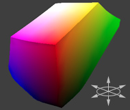
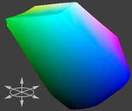
color space____________same color space rotated 180
The above diagram is intended to help you qualitatively understand and visualize a color space, however it would not be very useful for real-world color management. This is because a color space almost always needs to be compared to another space.
COMPARING COLOR SPACES
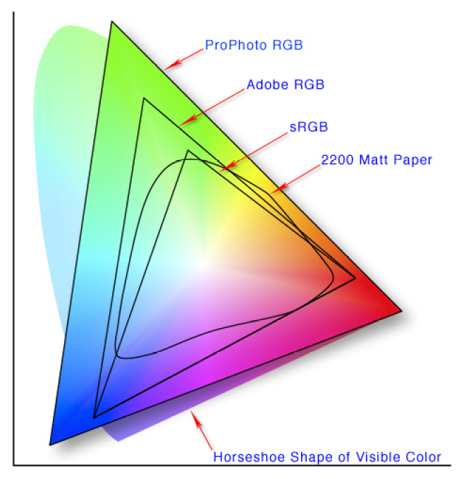
In order to visualize more than one color space at a time, color spaces are often represented using two-dimensional slices from their full 3D shape. These are more useful for everyday purposes, because they allow you to quickly see the entire boundary of a given cross-section. Unless specified otherwise, two-dimensional diagrams usually show the cross-section containing all colors which are at 50% luminance (a horizontal slice at the vertical midpoint for the color space shown above).
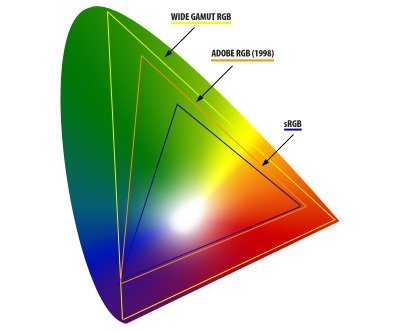 The diagram to the right compares three color spaces at once: sRGB, Wide Gamut RGB, and a device-independent reference space. sRGB and Wide Gamut RGB are two working spaces sometimes used for image editing.
What can we infer from a 2D color space comparison?Both the black and white outlines show the colors which are reproducible by each color space, as a subset of some reference space. Colors shown in the reference color space are only for qualitative visualization, as these depend on how your display device renders color. In addition, the reference space almost always contains more colors than can be shown on a computer display.
For this diagram, we see that the "Wide Gamut RGB" color space contains more extreme reds, purples, and greens, whereas the "sRGB" color space contains slightly more blues. Keep in mind that this analysis only applies for colors at 50% luminance, which is what occupies the midtones of an image histogram. If we were interested in the color gamut for the shadows or highlights, for example, we could instead look at a 2D cross-section of the color space at roughly 25% and 75% luminance, respectively.
TYPES: DEVICE DEPENDENT & WORKING SPACES
Color spaces. have many different types and applications. Common terminology includes:
Devices or working spaces that can realize more extreme colors are said to have a "wide gamut," whereas the opposite is true for "narrow gamut" color spaces.
REFERENCE SPACES
What was the reference space that was shown in the earlier comparison? Nearly all color management software today uses a device-independent space defined by the Commission International de l' clairage (CIE) in 1931. This space aims to describe all colors visible to the human eye based upon the average response from a set of people with no vision problems (termed a "standard colorimetric observer").
Note: Virtually all devices are subsets of the visible colors specified by the CIE (including your display device), and so any representation of this space on a monitor should be taken as qualitative and highly inaccurate.
The CIE space of visible color is expressed in several common forms: CIE xyz (1931), CIE L*a*b*, and CIE L u'v' (1976). Each contains the same colors, but they distribute these colors differently:
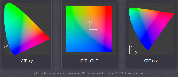
CIE xyz is based on a direct graph of the signals from each of the three types of color sensors in the human eye. These are also referred to as the X, Y and Z tristimulus functions (that were created in 1931). However, this representation allocates too much area to the greens — confining most of the apparent color variation to a small area.
CIE L u'v' was created to correct for the CIE xyz distortion by distributing colors roughly proportional to their perceived color difference. A region that is twice as large in u'v' will therefore also appear to have twice the color diversity — making it far more useful for visualizing and comparing different color spaces.
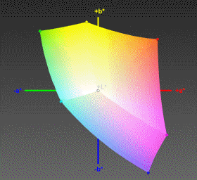
CIE L*a*b* remaps the visible colors so that they extend equally on two axes — conveniently filling a square. Each axis in the L*a*b* color space also represents an easily recognizable property of color, such as the red-green and blue-yellow shifts (used in the 3D visualization at the start of this tutorial). These traits make L*a*b* a useful color space for editing digital images, such as with Adobe Photoshop, GIMP, etc.
COLOR SPACE CONVERSION
Color space conversion is what happens when a color management module (CMM) translates color from one device's space to another. Conversion may require approximations in order to preserve the image's most important color qualities. Knowing how these approximations work can help you control how the photo may change — hopefully maintaining the intended look or mood.
BACKGROUND: GAMUT MISMATCH & RENDERING INTENT
The translation stage attempts to create a best match between devices — even when seemingly incompatible. If the original device has a larger color gamut than the final device, some of the those colors will be outside the final device's color space. These "out-of-gamut colors" occur with nearly every conversion and are called a gamut mismatch.
PERCEPTUAL & RELATIVE COLORIMETRIC INTENT
Each time a gamut mismatch occurs, the CMM uses the rendering intent to decide what qualities of the image it should prioritize. Common rendering intents include: absolute and relative colorimetric, perceptual, and saturation. Each of these types maintains one property of color at the expense of others (described below).
Perceptual and relative colorimetric rendering are probably the most useful conversion types for digital photography. Each places a different priority on how they render colors within the gamut mismatch region. Relative colorimetric maintains a near exact relationship between in gamut colors, even if this clips out of gamut colors. In contrast, perceptual rendering tries to also preserve some relationship between out of gamut colors, even if this results in inaccuracies for in gamut colors.The following example demonstrates an extreme case for an image within a 1-D black-magenta color space:
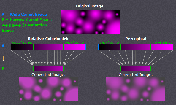
Note how perceptual maintains smooth color gradations throughout by compressing the entire tonal range, whereas relative colorimetric clips out of gamut colors (at center of magenta globules and in the darkness between them). For 2D and 3D color spaces, relative colorimetric maps these to the closest reproducible hue in the destination space.
Even though perceptual rendering compresses the entire gamut, note how it remaps the central tones more precisely than those at the edges of the gamut. The exact conversion depends on what CMM is used for the conversion; Adobe ACE, Microsoft ICM and Apple ColorSynch are some of the most common.
Another distinction is that perceptual does not destroy any color information — it just redistributes it. Relative colorimetric, on the other hand, does destroy color information. This means that conversion using relative colorimetric intent is irreversible, while perceptual can be reversed. This is not to say that converting from space A to B and then back to A again using perceptual will reproduce the original; this would require careful use of tone curves to reverse the color compression caused by the conversion.
ABSOLUTE COLORIMETRIC INTENT
Absolute is similar to relative colorimetric in that it preserves in gamut colors and clips those out of gamut, but they differ in how each handles the white point. The white point is the location of the purest and lightest white in a color space (also see color temperature). If one were to draw a line between the white and black points, this would pass through the most neutral colors.
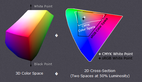
The location of this line often changes between color spaces, as shown by the "+" on the top right. Relative colorimetric skews the colors within gamut so that the white point of one space aligns with that of the other, while absolute colorimetric preserves colors exactly (without regard to changing white point). To illustrate this, the example below shows two theoretical spaces that have identical gamuts, but different white points:
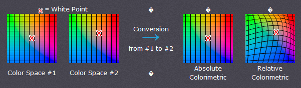
Absolute colorimetric preserves the white point, while relative colorimetric actually displaces the colors so that the old white point aligns with the new one (while still retaining the colors' relative positions). The exact preservation of colors may sound appealing, however relative colorimetric adjusts the white point for a reason. Without this adjustment, absolute colorimetric results in unsightly image color shifts, and is thus rarely of interest to photographers.
This color shift results because the white point of the color space usually needs to align with that of the light source or paper tint used. If one were printing to a color space for paper with a bluish tint, absolute colorimetric would ignore this tint change. Relative colorimetric would compensate colors to account for the fact that the whitest and lightest point has a tint of blue.
SATURATION INTENT
Saturation rendering intent tries to preserve saturated colors, and is most useful when trying to retain color purity in computer graphics when converting into a larger color space. If the original RGB device contained pure (fully saturated) colors, then saturation intent ensures that those colors will remain saturated in the new color space — even if this causes the colors to become relatively more extreme.
Saturation intent is not desirable for photos because it does not attempt to maintain color realism. Maintaining color saturation may come at the expense of changes in hue and lightness, which is usually an unacceptable trade-off for photo reproduction. On the other hand, this is often acceptable for computer graphics such as pie charts.